Architects design thresholds. Your website is one of them.
In 2018 I argued architects would need to design the thresholds between physical space and cyberspace. Eight years on the essay is Omni2's founding argument.
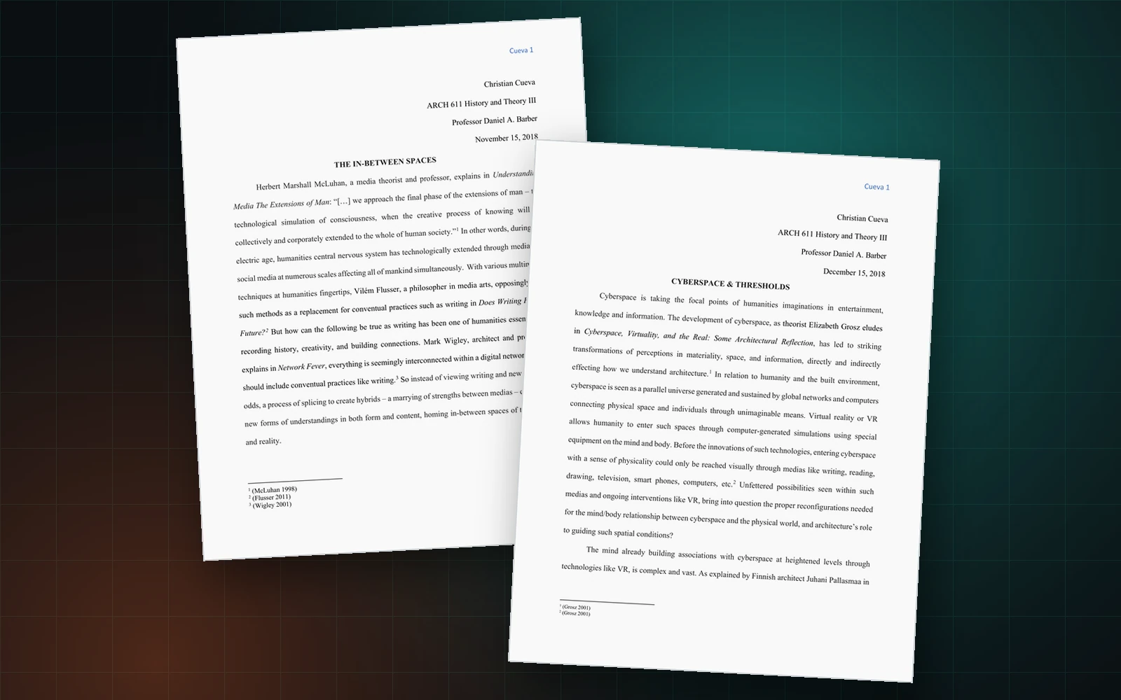
In December 2018 I handed in a graduate essay about how architects would need to design the thresholds between physical space and cyberspace. The essay was written for a history and theory seminar at Penn, I was partway through my MArch and MLA degrees, and I had no idea how to build a single thing I was describing. Eight years later the essay is the closest piece Omni2, our studio, has to a founding document.
Thresholds between mind, body, and space
Two essays, actually. The first, The In-between Spaces, was about media. The second, Cyberspace and Thresholds, was about where the body goes.
The first essay came out of a frustration with how the field talked about new tools. Vilém Flusser, a philosopher in media arts, had argued in Does Writing Have a Future? how writing was finishing, how what was once written would be carried better by tape, film and disk. The usual response was to defend writing. Both positions seemed wrong to me, because both assumed you had to pick a side.
The more useful move was splicing. Take two media, hybridize them, and you get capacities neither parent had. In other words, the strength is in the marriage rather than in the winner. Splicing is not a theory in architecture. Splicing describes what the field had always done. James Corner and Ian McHarg for example, both landscape architects, turned the historic practice of montage into the logic underneath GIS. Zaha Hadid’s practice ran from the analogue into the digital and kept the value of both, which is why the digital work still shows the hand and not the software.
The second essay took the same idea somewhere more physical: what happens to the relationship between mind, body and space when a parallel world is always available. John Frazer, architect and writer, put the answer plainly in The Architectural Relevance of Cyberspace. Virtual worlds, he wrote, “should not be seen as an alternative to the real world or a substitute, but as an extra dimension which allows us a new freedom of movement in the natural world.” In other words, the digital is not a replacement for the physical. The digital is another room in the same building.
Elizabeth Grosz, architect and philosopher, had already named the cost. In Cyberspace, Virtuality, and the Real, she describes “the change in our perceptions of materiality, space, and information, which is bound directly to affect how we understand architecture, habitation, and the built environment.”
If Grosz is right, somebody has to design the crossing. Architects have done exactly that work for every other threshold: the door, the lobby, the courtyard, the street. Deciding how a person moves from one condition into another, and how the crossing feels while they make it, is the discipline.
The thresholds I did not name
The imagery was narrow. I wrote about VR headsets and used Inception and Tron as my evidence, because the conversation lived there in 2018. Headsets turned out to be real, and studios now run client walkthroughs and coordination inside them. The threshold I did not name is the one almost everyone crosses, a browser on a phone. The spectacular case was real. The ordinary case was bigger.
The threshold is the website. The threshold is the client portal. The threshold is the project page somebody reads at eleven at night before deciding whether to call you.
For most firms shaping the built environment, the digital surface is now the first and often the only experience anyone has of the work. A developer evaluating you, a client comparing three studios, a graduate deciding where to apply: each one meets the practice through a screen long before standing inside anything the practice built. A screen is a threshold, and a screen always was one. The crossing is no longer speculative, but rather the first medium anyone judges, and the least designed interface most practices own.
Why the website never matches the building
Walk through a design-first practice’s portfolio and the work is exacting. Every reveal, every material junction, every sightline has been argued over for weeks. Then open the same practice’s website. Stock template, stacked images, a contact form from 2014.
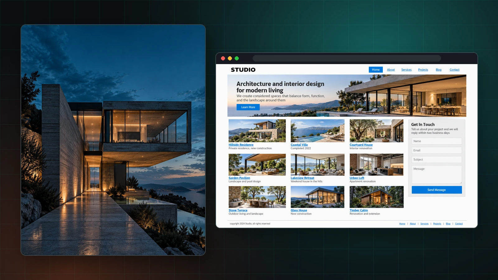
The screen itself is not undesigned. UX and product designers have been doing rigorous work there for thirty years. The disconnect is stranger than neglect. The profession most devoted to how people move through space holds almost no standard for how people move through its own digital space.
Some of the reason is structural, because no fee proposal has a line item for digital presence, so the work reads as overhead rather than design and goes to whoever costs least. Some of the reason is cultural, since self-presentation has always sat uneasily in a profession trained to let the work speak. The rest is mechanical.
A firm needs a website, so the firm hires a web agency or a brand studio. Then the firm needs something doing real work: a client portal, a document handoff, a lead intake, a project dashboard. A portal is software, so the firm hires somebody else, or a developer, or nobody at all and the work drifts into shared drives and email threads.
Most web agencies cannot build the software. Most software shops cannot design the site. So the threshold gets split between two vendors who never speak, and the firm ends up with a brochure flattering the work and a tool nobody wants to open. The seam between the two is exactly where the experience breaks, and nobody owns the seam.
Architects already know the feeling. A single project lives in Rhino for the form, AutoCAD or Revit for the documents, SketchUp for the quick studies, Enscape or Lumion for the renders, Bluebeam for the markups, InDesign for the boards, and every move between them takes a toll. Geometry simplifies, layers rename themselves, a material assignment vanishes, somebody rebuilds the same wall a third time. The work survives because people absorb the losses by hand. A practice’s digital presence is the same arrangement with less attention paid: the brand in one place, the website in another, the client tools in a third, and nothing underneath connecting the three.
So who designs the seam? If a firm’s clients now meet the practice through a screen before they ever stand in a room the practice built, whose job is the crossing? And if the crossing belongs to nobody, what are we actually handing those clients?
The splice
Which brings the 2018 argument back around, because splicing is still the answer.
Do not choose between design practice and software practice. Splice them. One team that designs the marketing site and builds the client portal, with the same hands and the same system underneath, so nothing needs stitching together later.
A splice is not a service menu. A splice is a method, and a method has consequences. The portal inherits the brand instead of fighting the brand. The site gets built in code rather than assembled, because a working product has to respond, store, and update, not just sit there. And one design system runs underneath the brand, the site, and the portal alike.
The method also means staying small on purpose. Clients work directly with the people designing and building their project, because a splice does not survive a handoff.
We come to the method from inside the profession. We have worked for design-first studios and we know the standard the work gets held to. We hold the digital side to the same standard.
The splice in practice
For ArchRecon, an architecture studio, the engagement started at the identity and ran all the way into the software. We designed the brand, then the public site, then the client portal, as one system rather than three projects. Same typeface, same spacing, same logic underneath, from the logo to the portal’s data tables. The site carries the work. The portal gives their clients one home for every project, deliverable and request. A client moves between site and portal and never feels a handover, because no handover exists.
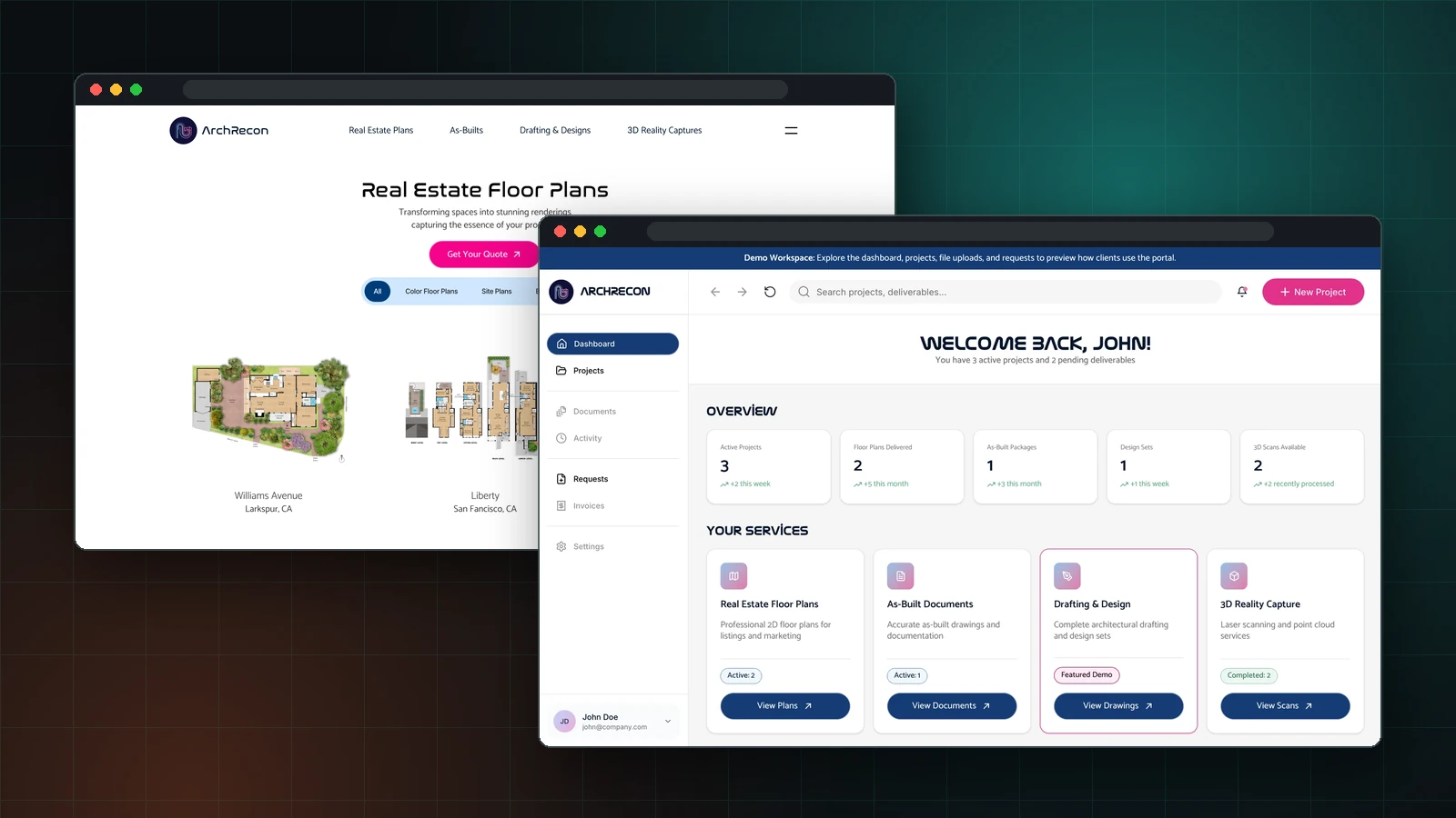
The 2018 argument, built.
Standard details for the screen
Every practice keeps a set of standard details. The window head shedding water, the parapet surviving ten winters, the stair meeting code and still looking like yours. Nobody redraws them from nothing on each project. They get refined, reused and carried forward, and the practice gets faster and more consistent because the thinking is already done.
A design system is the same instrument for the screen. Tokens hold the decisions, color and type and spacing. Components hold the resolved assemblies, a card, a table, a form. The next page takes an hour instead of a week, for the same reason the next window head does.
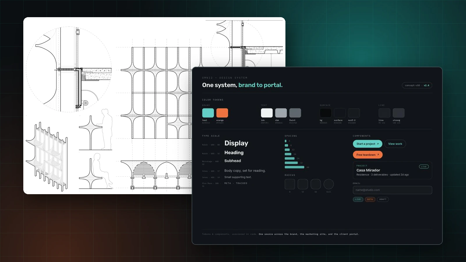
The method is not borrowed from software. Software borrowed the method from architecture. Christopher Alexander, an architect, published A Pattern Language in 1977, a catalogue of resolved spatial problems meant to be combined rather than reinvented. When software set down its own patterns nearly two decades later, the authors of Design Patterns named him as the source, and the component model running almost every product you use descends from the lineage. Architecture produced the pattern language and is among the last to use the method on its own digital surface.
What the method commits us to
Five things, and we are held to them.
- Human experience. We design for how people actually move, see and behave, not how a diagram says they should.
- Many voices. We come from the same field, so we understand the discipline and work with your people rather than around them.
- Craft and computation. We use AI where judgment is not required, and we never let the tools decide the design.
- Systems thinking. One system under the brand, the site and the software, for the same reason a practice keeps one set of standard details.
- Adaptive by default. No two engagements run the same way, because a method unable to bend to a practice is a template.
The threshold is yours
Architecture has always been the discipline deciding how a person crosses from one condition into another, and what the crossing costs them. The condition on the other side of the screen is where most people will meet your practice first.
Architects have spent a long time being handed the thresholds nobody else wanted to design. The screen is the newest one, and the job has not changed: decide how a person arrives, what they understand on the way, and how little the crossing costs them. Both sides of the threshold are yours to design.
Common questions
- Do architecture firms need a custom website, or is a template enough?
- A template is enough for a brochure. A template is not enough the moment the site has to do real work: carry a portfolio built around real projects, feed a Statement of Qualifications, or connect to the software a practice runs on. A template sits still, and a practice's digital presence is now the first thing a developer or client judges. For a firm competing on the quality of the work, a built site holds the digital surface to the same standard the building is held to.
- Why do so many architecture firm websites look the same?
- Most come from the same small set of templates, so the same layouts repeat across firms doing very different work. Two forces keep the pattern in place. No fee proposal has a line item for digital presence, so the work reads as overhead and goes to whoever costs least. And self-presentation has always sat uneasily in a profession trained to let the work speak. The result is a strong practice behind a generic site.
- What should an architecture firm's website include?
- At minimum: project pages built around real work rather than stock imagery, a clear path for a developer or client to start a conversation, and a design system underneath so every page stays consistent as the practice grows. Beyond the marketing site, most firms also need a web app doing real work: a client portal, a project dashboard, lead or bid intake, or an internal tool. The site and the software should share one system, so a visitor never feels a seam between them.
- What is the difference between a marketing site and a web app for a practice?
- A marketing site presents the practice: the work, the people, the way into a conversation. A web app does real work the firm and its clients rely on, most often a client portal for files, deliverables and project status, but also a project dashboard, a lead or bid intake, or a Statement-of-Qualifications tool staying in sync. A marketing site tells the story, and a web app does the work. Built by separate vendors, the two break at the seam between them. Built as one system, a person moves from one to the other and never feels a handover.
- Who should design an architecture firm's website?
- Someone who understands both design and the building profession, and who can build the software as well as the site. Most web agencies cannot build the software, and most software shops cannot design the site, so the threshold usually gets split between two vendors who never speak. The stronger arrangement is one team holding both sides, ideally a team coming from inside the field, so the digital work gets held to the same standard as the built work.
Sources
The two essays behind the argument above were written for ARCH 611, History and Theory III, at the University of Pennsylvania in 2018.
- 01Elizabeth Grosz, “Cyberspace, Virtuality, and the Real: Some Architectural Reflections,” in Architecture from the Outside (MIT Press, 2001)
- 02John Frazer, “The Architectural Relevance of Cyberspace,” in Architects in Cyberspace, ed. Neil Spiller and Martin Pearce (Academy Editions, 1995)
- 03Vilém Flusser, Does Writing Have a Future? (University of Minnesota Press, 2011)
- 04Karen M’Closkey, “Structuring Relations: From Montage to Model in Composite Imaging,” in Composite Landscapes (Hatje Cantz, 2014)
- 05Gordana Fontana-Giusti, “Zaha Hadid: 1950-2016,” Architectural Research Quarterly 20, no. 2 (2016)
- 06Christopher Alexander, Sara Ishikawa, and Murray Silverstein, A Pattern Language: Towns, Buildings, Construction (Oxford University Press, 1977)
- 07Erich Gamma, Richard Helm, Ralph Johnson, and John Vlissides, Design Patterns: Elements of Reusable Object-Oriented Software (Addison-Wesley, 1995)

Christian Cueva
Founder of Omni2 Design, building websites and web apps for AEC firms. Architect by training. About the studio